THE STORY BEHIND THE STORYTELLING
Crafting a Microbrand from Concept to Rebranding
Episode 4: The Art of Design
Welcome to our final episode!
Today marks the final episode of this mini-series on reshaping my brand's identity. If you missed any previous episodes or would like to revisit them, click here. This project aims to give you a behind-the-scenes look at building a microbrand and let you be part of the journey.
In the last episode, I shared my thought process for our brand reshaping and gave you the chance to vote for our new slogan. Many of you participated, and I truly appreciate it!
Without further ado, I’m excited to reveal our new slogan:
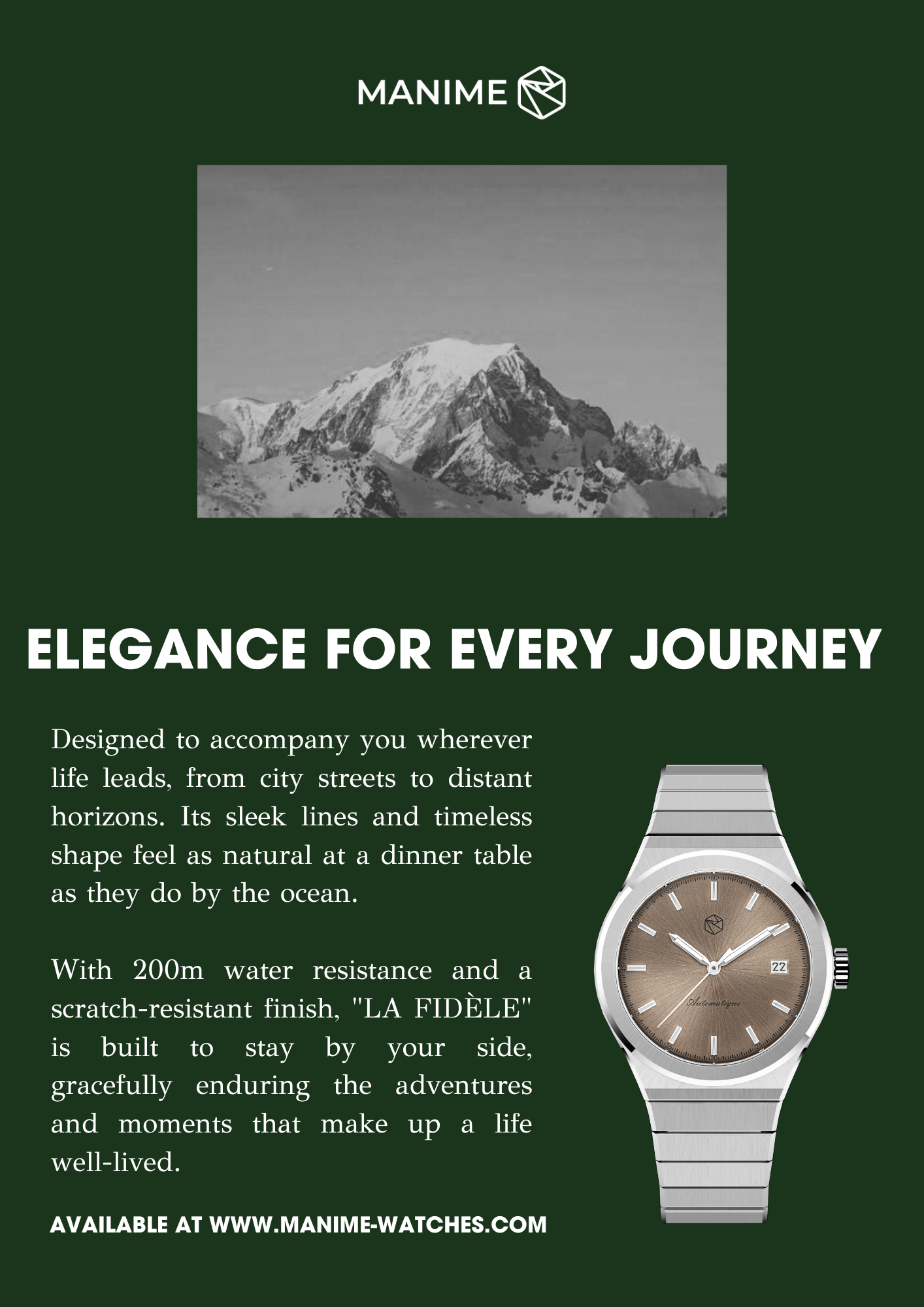
“ELEGANCE FOR EVERY JOURNEY”
This new slogan means more than just travel. It’s about carrying elegance through every stage of life — from big milestones to everyday moments. It reflects a style that stays with you, wherever you go and whoever you become.
It’s short, simple, and perfectly captures what we want MANIME to stand for. This slogan will be everywhere – on our website, social media, and marketing materials. Your choice will be seen by everyone!
I’d also like to extend my gratitude to everyone who provided feedback and reached out.
Hearing from fellow microbrand owners who shared their stories and asked questions has been amazing. The world of microbrands is full of passionate entrepreneurs, and helping others has made this project even more rewarding.
Now, let’s dive into the most exciting part: the design!
I’ll walk you through my thought process and present our next model.
It all began with a blank page.
Designing your first watch is actually simpler than creating the second.
Why? Because the first model lays down the brand’s design language. It’s the foundation—the visual DNA that defines everything that follows. Once that identity is set, consistency becomes key. Each new model has to align with that signature aesthetic so that your watches are instantly recognizable. The challenge is finding the balance: honoring the legacy of the first design while still pushing creative boundaries.
Whenever I start working on a new model, I begin by choosing the complication—should it be a classic three-hander, a date display, a moonphase?
For this one, I knew I wanted to create a GMT.
It's a complication I've always liked, and the original Rolex GMT, developed in the 1950s to help PANAM pilots track multiple time zones, carries a truly fascinating story.
It’s a complication that’s deeply tied to the spirit of travel and adventure—values that resonate deeply with me. One of my ultimate grail watches, in fact, is the Rolex GMT-Master II 6542, with its iconic bakelite bezel.
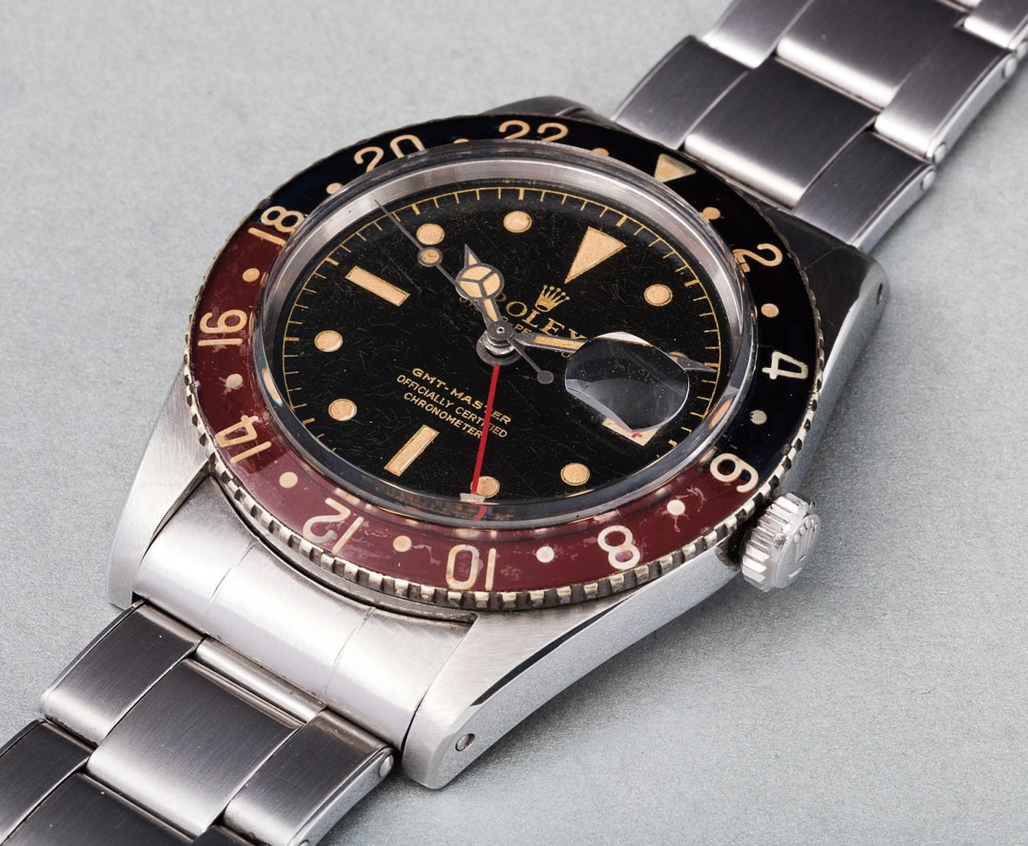
But designing a GMT watch isn’t without its challenges. The influence of the Rolex is so strong that it’s easy to fall into imitation. My first sketch did exactly that—it looked like LA FIDÈLE dressed up with too much Rolex DNA. It wasn’t right.
So I scrapped it.
It didn’t feel original. More importantly, it didn’t feel true to what I want MANIME to stand for. I went back to the drawing board, committed to creating a GMT that was authentic, and unmistakably MANIME—one that pushes boundaries while staying rooted in our design language.
(– Image by Phillips)
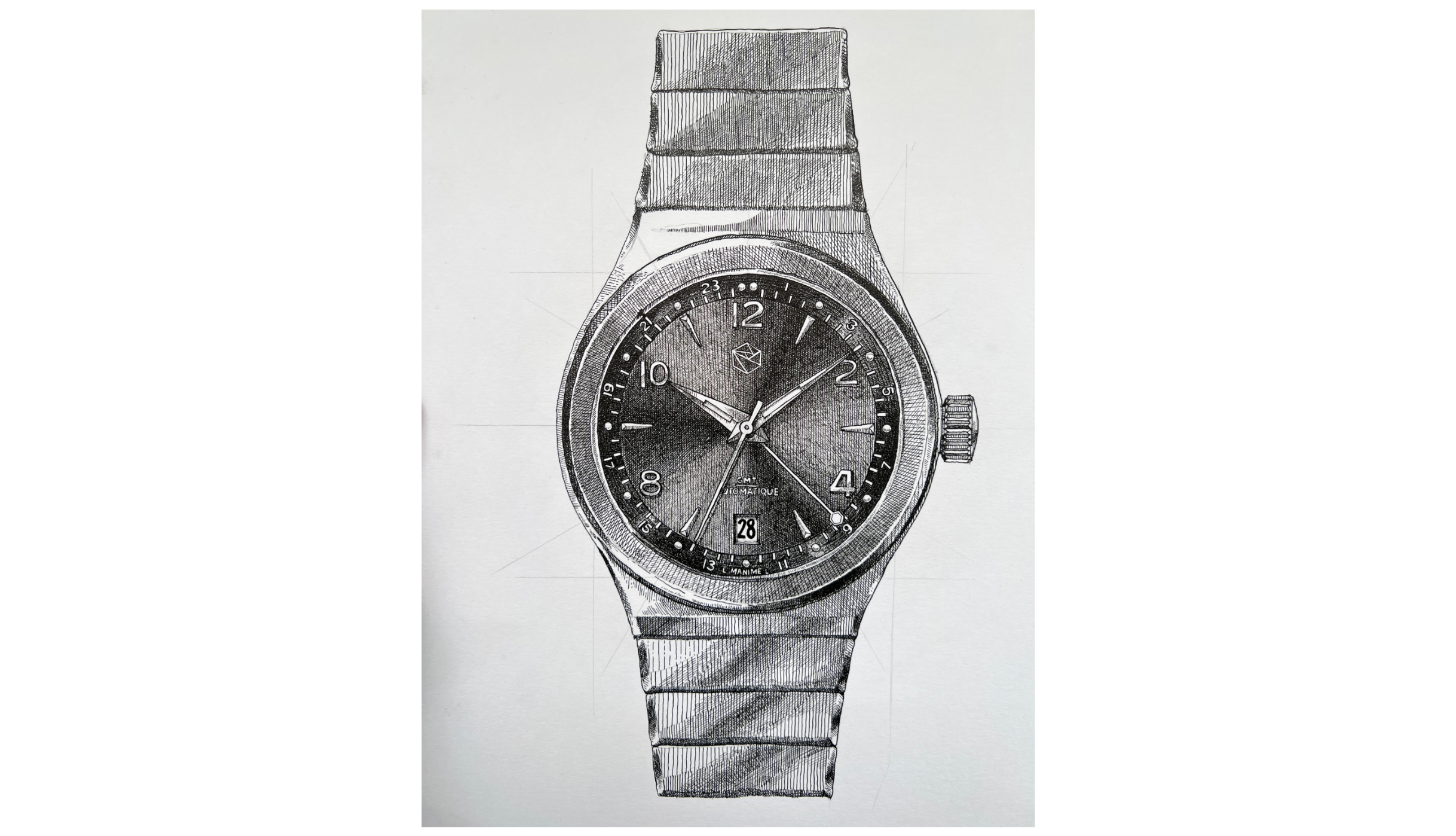
How did I come up with this design?
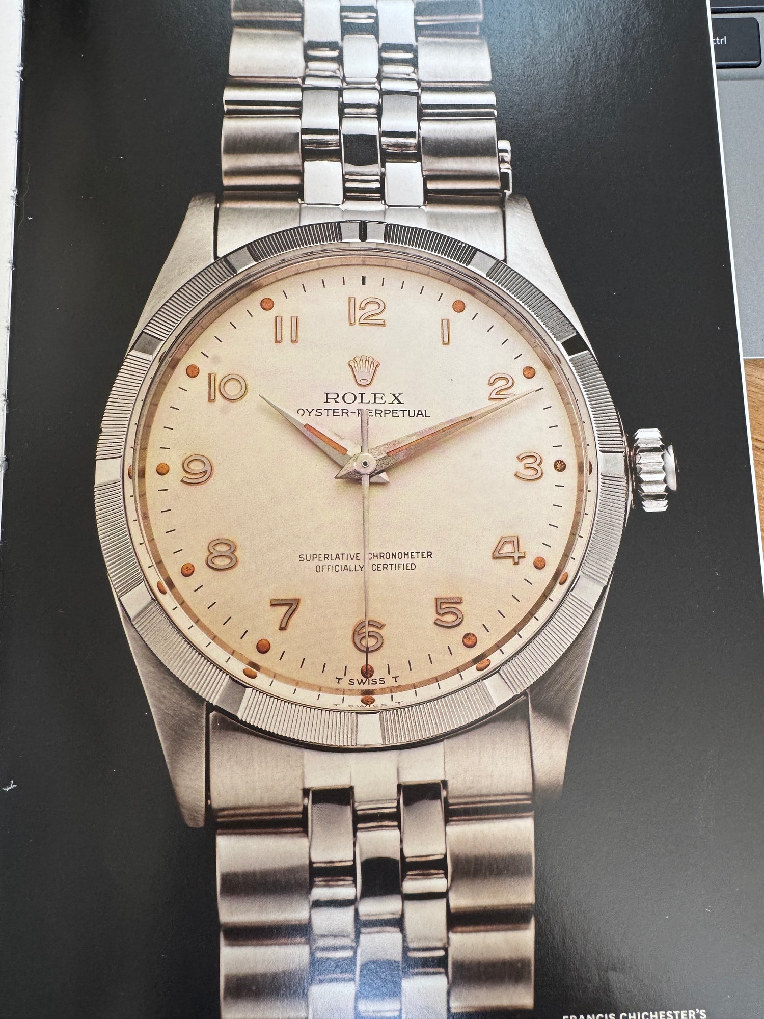
It all started while I was flipping through the iconic book A Man and His Watch by Matt Hranek. On one page, I came across a Rolex Oyster Perpetual. This watch was used by Francis Chichester who sailed from England to Australia in the 60s.
What struck me about that particular version was its unique blend of styles. Being 226 days on the sea, this watch is definitely a tool watch, but the elegant dauphine hands—typically seen on dress watches—added a refined touch. The numerals gave it a slightly technical edge.
It is very interesting to look at this watch, it isn’t strictly a tool watch, nor a dress watch. It was something in between—what I’d call sport-chic watch.
That mix of elegance and function sparked something. I started sketching with that idea in mind, always careful to stay true to MANIME’s design identity.
So I checked the DNA we established with our first two models: “LA F.” and “LA FIDÈLE.” Each has its own character, but both share the design language that defines MANIME.
“LA F.” is a dress watch with subtle sporty notes—dauphine hands, spear-like indexes, and dotted lume. “LA FIDÈLE” flips the formula—a sporty watch with elegant refinements, like its polished chamfers, fluid curves, and robust bracelet.
So for this new GMT design, I took elements I love from both models and merged them with my inspiration from that Oyster.
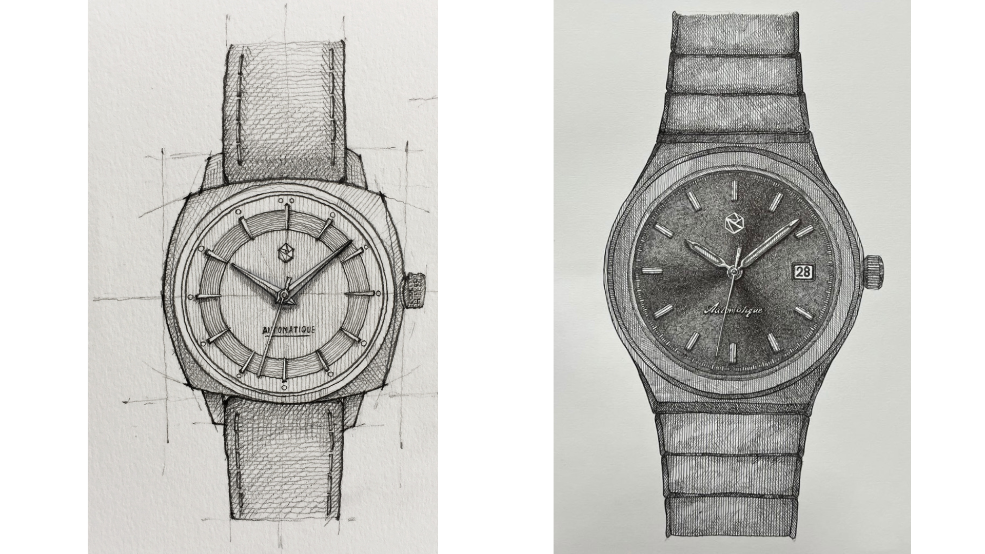
The result? A minimalist, refined GMT—one that leans away from the rugged, technical style you often see with this complication. It’s a quieter expression of travel and timekeeping.
More gentleman explorer than cockpit commander. A GMT that feels unmistakably MANIME.
These are early concepts, and we’ll need to prototype them to see which ones truly come to life on the wrist. I'd love to hear your thoughts—drop a comment below with your favorite, or let me know which color you'd like to see tested.
In detail
What I truly love about this dial is the harmony between its elements—the sunburst effect, the indexes, the dauphine hands, and the dotted lume. Each part feels intrinsically connected, forming a cohesive and balanced visual story.
Take the sunburst finish, for example. To me, it’s like a firework—it starts at the center and radiates outward. It breathes life into the watch, adding a dynamic energy that a matte dial simply can’t replicate.
The indexes echo this movement. Their conical shape widens as it reaches the edge, amplifying the sunburst’s sense of motion. At their tips, the dotted lume serves as the final spark—like the glimmer at the end of a firework’s trail, a subtle but essential punctuation.
And the hands? The dauphine hands mirror the geometry of the indexes, perfectly aligned in both proportion and angle. This visual repetition reinforces the design’s symmetry, bringing a sense of unity and refinement that ties everything together.
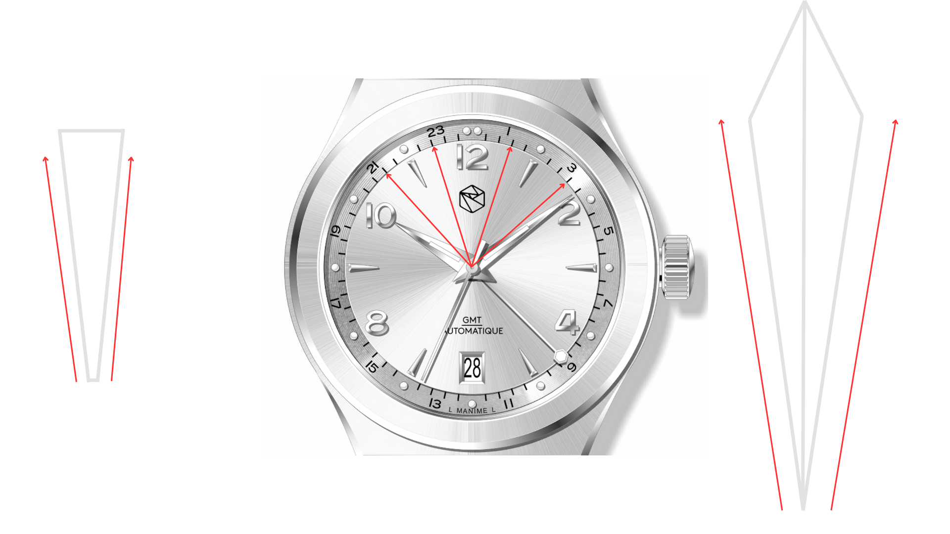
The Numerals and the Minute Tracker
In the first sketches, I went with only spear-like indexes—but something felt off. The result was a bit too stark, too sterile. So I added numerals at 12, 2, 4, 8, and 10. That slight contrast immediately brought the design to life. It gave the watch a stronger sport-chic vibe, much like the contrast found on the Oyster.
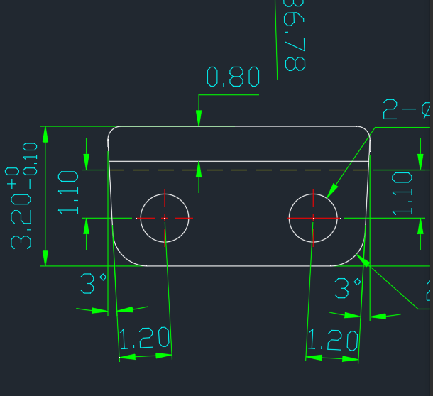
For the minute tracker, I placed it one level below the dial surface, adding depth and dimension. I gave it a vinyl-like texture to break the flatness and introduce some subtle visual richness.
Tiny Details That Make the Difference
As watch lovers, we know it’s the little things that make a timepiece truly special. With this model, I’ve added a few thoughtful touches I’m particularly proud of.
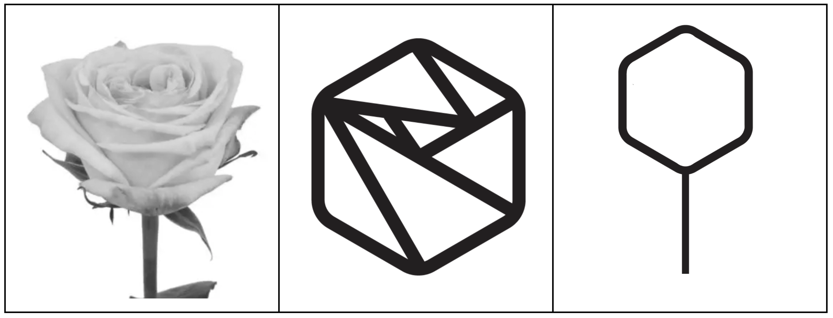
One of them is the second hour hand. I originally designed it as a classic arrow-style hand, the kind you see on many GMTs. But my wife made a suggestion (and let’s not tell her she was right): why not use the shape of our logo?
In Episode 1, I talked about how MANIME was built on the theme of friendship. The logo—a minimalist side profile of a yellow rose—symbolizes that. Integrating this shape into the second hour hand was a way to subtly weave the brand’s story into the function of the watch.
It adds meaning, without saying a word.
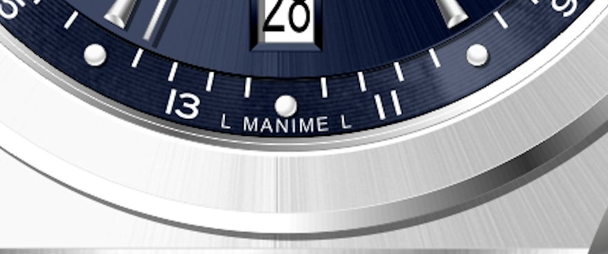
Another small but meaningful evolution: the name “MANIME” now appears on the dial. On our previous models, I intentionally left it off—a lucky choice, as I later had to change the brand name due to trademark issues (more on that in Episode 1). But now that the name is officially registered, I felt it was time to display it—proudly but subtly.
I drew inspiration from brands I admire, like SERICA, whose minimalist dials manage to feel refined yet understated. I’ve placed “L MANIME L” at 6 o’clock, tucked behind the minute track, in the same spirit as vintage Rolex watches that marked “T SWISS T” at the bottom of the dial to indicate the use of tritium. Here, the “L” stands for Luminova, giving a quiet nod to vintage watches.
Improvements to the Bracelet
You asked for it—and I heard you: micro-adjustments are coming. LA FIDÈLE’s bracelet lacked that flexibility, and I agree it was a miss. But I still wanted to keep the butterfly clasp, which keeps the bracelet seamless and gives it that clean, uninterrupted look when worn.
While I can't share images of the new clasp just yet, the mechanism allows for tool-free micro-adjustments—something that will make a real difference in day-to-day comfort whilst keeping the butterfly clasp.
That’s not all. The bracelet design itself is evolving. On LA FIDÈLE, the end-links were squared off. For this new model, I’ve softened the edges and curved the profile to improve wearability and elevate the overall elegance.
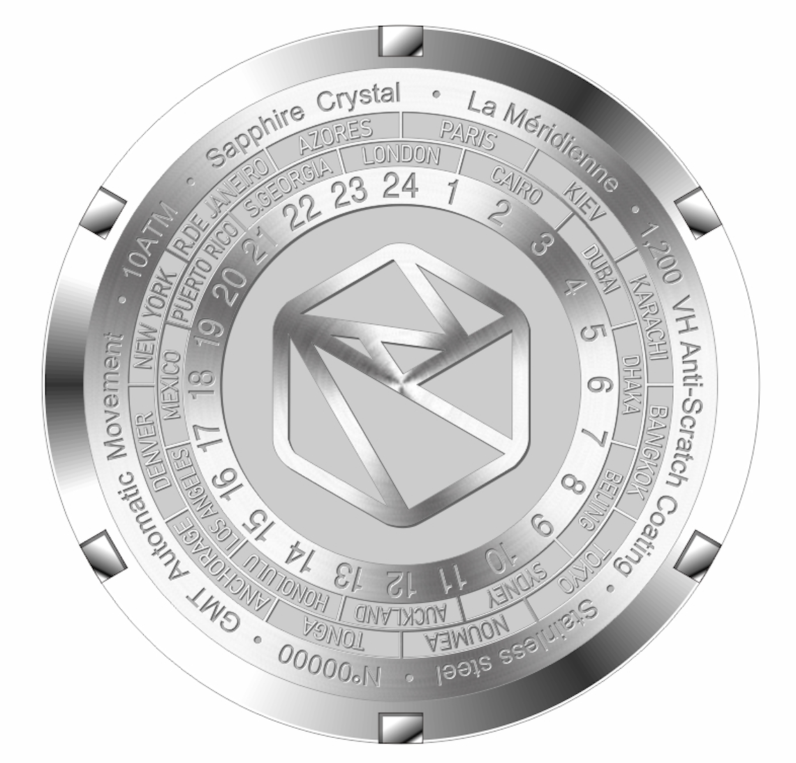
The Caseback
For this model, I’ve chosen not to display the movement. Why? Because I want to keep the case as thin as possible. Instead of a sapphire window, the caseback features an engraving of world time zones. It’s a nod to the spirit of travel—and a practical touch if you ever need to check the time difference between countries on the fly.
Another upgrade: the brushing. One piece of feedback I got was that the brushing on the case and bracelet could feel more refined. So we’re increasing the depth of the brushing to enhance the watch’s overall luxurious feel.
And finally the specs:
- MOVEMENT: Automatic premium Japanese Miyota 9075
- DIMENSIONS: 38mm and 42.2mm lug to lug
- THICKNESS: 11.4mm
- LUME: Swiss Super-LumiNova® BGW9
- POWER RESERVE: 42 hours
- CASE & BRACELET: Surgical Stainless Steel 316L with Special Anti-scratch Hardening treatment - butterfly clasp with micro adjustments
- GLASS: Sapphire crystal glass with anti-reflective coating
- WATER RESISTANCE: 10 ATM - 100m - 330 ft
The Name ?
I came up with the name “LA MÉRIDIENNE”, I chose this name to reflect the essence of a GMT watch: a timepiece designed to track multiple time zones and accompany you across borders.
In French, la méridienne refers to the meridian—those invisible lines that structure time across the globe. It’s a direct reference to travel, international connections, and the technical function of a GMT.
At the same time, it subtly nods to French heritage and our new slogan : ELEGANCE FOR EVERY JOURNEY.
Conclusion
And that’s it! This was the final episode of “The Story Behind the Storytelling.”
I hope you enjoyed discovering the journey behind MANIME and what it really means to build a microbrand. Creating this series has been an incredible experience—it helped me refocus the brand, gain clarity on our direction, and reflect on the road ahead.
Connecting with you throughout this process has been truly rewarding, and I hope we’ll keep the conversation going—whether on social media or by email.
Now, it’s time to move into the prototyping phase. This part takes time, but it’s essential to ensure we bring you a product we’re truly proud of.
If you’d like to keep following the project, you can find us on Instagram or Facebook—or simply drop your email below to stay updated.
Thanks again for being part of the journey!
Édouard.
Enjoyed this episode? Drop me your email address below, and I'll add you to the list to keep you updated on the next development.